Color plays a major role in men’s fashion, helping to define personal style and create an impression. The way colors are paired can elevate a basic outfit into something stylish and well-coordinated. While it may seem difficult at first, pairing colors doesn’t have to be complicated. With a few simple rules, you can easily create outfits that are both eye-catching and well balanced.
In this article, we’ll cover the fundamentals of color pairing in men’s fashion, from understanding basic color combinations to putting them into practice for everyday wear. Whether you’re aiming for a casual look or dressing up for a formal event, mastering color coordination is key.
The Importance of Color in Men’s Fashion
First Impressions Matter
In the world of fashion, color can speak volumes. The colors you wear can affect how others perceive you and the impression you leave. For example, wearing a well-tailored navy suit often projects professionalism, while lighter tones like beige or pale blue convey approachability. Similarly, darker shades like black or charcoal grey can suggest authority or sophistication.
Enhancing Your Wardrobe
Understanding how to pair colors not only helps you look better, but it also allows you to maximize your wardrobe’s potential. With just a few neutral colors—like black, white, navy, and grey—you can create a variety of outfits. Knowing how to combine these shades with accent colors (such as red, green, or yellow) can turn simple outfits into stylish ensembles. This saves time and money by reducing the need for excessive purchases.
Basic Color Pairing Rules
The Power of Neutrals
Neutral colors are versatile and timeless. Black, white, grey, navy, and beige are all considered neutral, and they pair well with almost any other color. These colors serve as the foundation of most wardrobes, allowing for easy outfit creation.
For example:
- A black shirt can be paired with almost anything, from grey trousers to blue jeans.
- A grey blazer looks polished with a white shirt and navy pants.
- Navy trousers complement everything from light-colored shirts to bold red jackets.
Complementary Colors
Complementary colors are those that are opposite each other on the color wheel, such as red and green, or blue and orange. These combinations create a striking visual contrast, which can be appealing when used correctly. The trick is to balance the intensity of the colors. A bold red shirt with deep green pants might be too overpowering, but a dark green jacket with a soft red tie creates a more subtle and effective look.
Analogous Colors for Subtle Combinations
Analogous colors are next to each other on the color wheel, like blue, teal, and green. These colors blend together effortlessly, creating a harmonious and pleasing effect. When paired correctly, analogous colors create outfits that are balanced and soft.
For instance, pairing a light blue shirt with navy pants and a teal scarf creates a visually appealing, cohesive look. The colors don’t clash but complement each other nicely, making it a safe and stylish option for almost any occasion.
Practical Color Pairing Tips
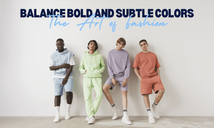
Balance Bold and Subtle Colors
When combining bold colors with neutrals, you can create a balanced outfit that doesn’t look overdone. The key is to keep one color dominant while using the other as an accent. For example, if you’re wearing a bright red shirt, pair it with dark jeans or a black jacket to tone down the intensity.
Here are some tips:
- Pair a bold red jacket with black jeans for an edgy look.
- Combine a bright yellow tie with a navy suit to add a pop of color without overwhelming the outfit.
- A green shirt can be softened with grey trousers or tan chinos.
Monochromatic Looks for a Polished Appearance
Monochromatic outfits, where you wear one color in different shades, can look sleek and refined. This is a simple way to pull off a stylish look without worrying about matching multiple colors. The trick is to use varying shades of the same color to avoid looking too uniform.
For example, a charcoal grey suit with a light grey shirt and dark grey tie can create a very polished and modern look. You can even experiment with different textures, such as a wool jacket and a silk tie, to add depth to the outfit.
Pattern Mixing with Color Coordination
When wearing patterns, it’s important to keep color in mind. For example, a checkered shirt can be paired with a solid-colored tie in a matching tone to keep the outfit cohesive. Another example would be wearing a striped jacket with a plain shirt of a matching color.
Here’s how you can mix patterns and colors effectively:
- Pair a plaid shirt with solid-color pants (e.g., a blue plaid shirt with navy trousers).
- A striped suit can be paired with a solid shirt to balance the patterns.
Popular Color Combinations for Men’s Fashion
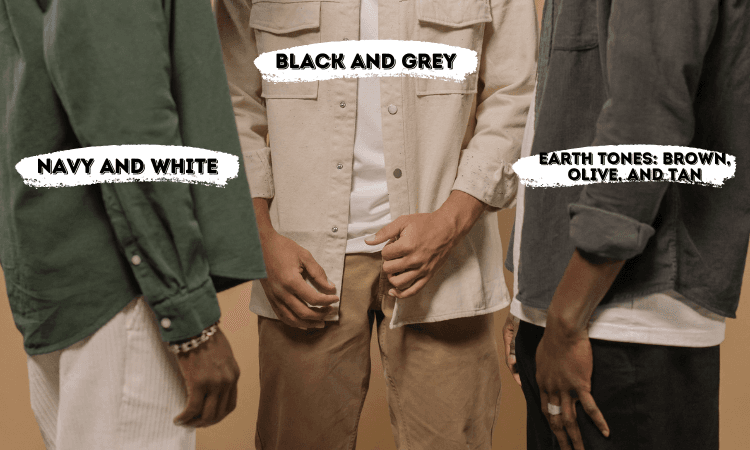
Navy and White
Navy and white is one of the most timeless combinations in men’s fashion. This pairing works well in both casual and formal settings. Navy provides a calm, professional vibe, while white adds brightness and contrast. A navy blazer paired with a white shirt is a classic choice for a business casual look, while navy pants and a white T-shirt create a clean, simple, and casual outfit.
Black and Grey
Black and grey is a sleek, minimalist combination that exudes sophistication. The dark tones work well together, creating an elegant and contemporary look. A black suit with a grey tie and a white shirt is an excellent option for formal events. For a more casual approach, grey jeans and a black leather jacket can create a cool, urban look.
Earth Tones: Brown, Olive, and Tan
Earth tones like brown, olive, and tan are perfect for autumn outfits or more laid-back looks. These colors complement each other naturally and add warmth to an outfit. Pair olive pants with a tan jacket or wear a brown sweater with beige trousers. Earth tones are especially great for casual events or weekend wear.
Common Mistakes to Avoid
Overuse of Bright Colors
While bright colors can be fun, wearing too many of them in one outfit can create a chaotic appearance. It’s important to balance vibrant colors with neutral tones to avoid overwhelming the look. For example, if you’re wearing a bright orange jacket, pair it with neutral trousers or a white shirt.
Clashing Colors and Patterns
Some color combinations and patterns simply don’t go together. For instance, pairing red and green in their purest forms can create a jarring effect, while mixing too many patterns can lead to visual overload. Stick to one bold element per outfit and balance it with solid colors.
Ignoring the Occasion
Your outfit should be appropriate for the occasion. Bright, bold colors may be fine for a casual outing, but for formal events, more subdued tones work better. Similarly, some colors are better suited to different seasons—dark tones are ideal for winter, while lighter shades are perfect for summer.
Conclusion
Color coordination in men’s fashion is an essential skill that can significantly improve your style. By understanding the basics of color pairing, you can create a variety of outfits that reflect your personality and suit different occasions. Remember to balance bold and neutral colors, experiment with different combinations, and always consider the event or season. With these tips in mind, you can confidently step out looking well-dressed and put-together, whether for a professional setting or a casual day out.