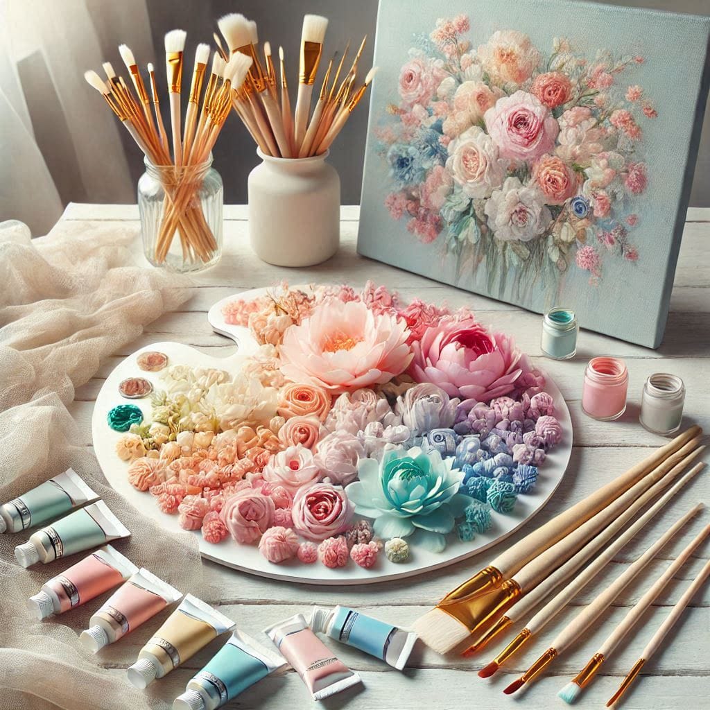
Pastel colors are light, soft shades that are easy to love. These colors can bring calmness and warmth to any design, whether it’s in fashion, home decor, or digital art. However, combining pastel colors can be tricky. If you use too many pastels in one space or design, the result can feel overwhelming and chaotic.
Understanding Pastel Colors and Their Appeal
Before we dive into how to combine pastels, let’s take a moment to understand what they are and why people love them.
What Are Pastel Colors?
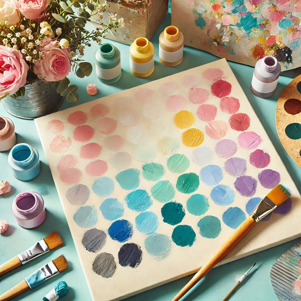
Pastel colors are light versions of colors like pink, blue, yellow, and green. They have a soft and faded look, making them gentle on the eyes. Pastel shades are made by mixing a color with white to lighten it.
Why People Love Pastels
Pastels are popular because they feel calm and peaceful. These colors can make a space feel open and airy. People often use pastels to create soothing environments, whether in their homes or on their clothing. In addition, pastel colors are versatile and can match with many other colors.
The Risks of Overusing Pastels
While pastels are beautiful, using too many of them together can be risky. Too many pastel colors in one design can make the space or outfit feel too soft, flat, or even dull. When used excessively, pastels may lose their charm and create a sense of imbalance.
Key Principles for Combining Pastel Colors
Now that we know what pastels are, let’s look at how to combine them effectively. There are a few simple rules to follow.
Start with a Neutral Base
When combining pastels, it’s important to start with neutral colors. Neutral tones like white, beige, or light grey can serve as the foundation of your design. These colors help balance the softness of pastels and prevent the space from feeling too colorful or busy. For example, a white wall with pastel furniture or decor items can look both calm and stylish.
Limit the Number of Pastels
It’s easy to get carried away with pastel colors, but less is more. It’s best to limit your pastel colors to two or three main shades. Too many pastel colors can make the design feel crowded and overwhelming. If you use too many shades, the soft look of pastels can get lost. Stick to a small palette of complementary pastel colors for a more polished, balanced look.
Balance Warm and Cool Tones
Another important rule is to balance warm and cool pastel tones. Warm pastels like peach, pink, and yellow create a cozy, inviting feeling. Cool pastels like lavender, mint, and baby blue are calming and refreshing. When combining pastels, try to mix warm and cool tones to create a balanced, pleasing look. For example, pairing a soft pink with a cool mint green can create a nice harmony between the two colors. This contrast prevents the design from feeling too one-dimensional.
Tips for Combining Pastels in Different Design Areas
Pastels can be used in various areas of design. Let’s explore how to combine them in fashion, home decor, and graphic design.
- Fashion and Personal Style
In fashion, pastels are often worn during the spring and summer months. To combine pastels in an outfit, start with one pastel as your main color, and use others as accents. For example, you could wear a pale blue dress and pair it with a soft pink scarf or pastel shoes. If you want to keep it simple, add a neutral color like white or beige to break up the pastels and make the outfit more balanced.
- Home Decor and Interior Design
In home decor, pastels can brighten up any room. To combine pastels in your home, start with a neutral-colored base, like white or light grey walls. Then, add pastel-colored furniture or accessories. For example, a light grey couch can be paired with pastel-colored pillows in shades of lavender and mint. To avoid a washed-out look, add a few bolder accents, like a deep blue vase or a patterned rug, to give the room some depth and contrast.
- Graphic Design and Digital Art
Pastels are also popular in graphic design and digital art. When using pastels in designs, it’s important to make sure there’s enough contrast between colors. For example, pastel backgrounds work well with darker text or images to make them stand out. You can also mix pastel colors with neutral tones, like grey or beige, to create a soft, balanced design that’s easy on the eyes.
Common Mistakes to Avoid When Using Pastel Colors
Even though pastels are beautiful, they can easily be overused. Here are some common mistakes to watch out for.
Overloading with Too Many Shades
Using too many pastel shades in one design is a common mistake. The more pastels you use, the harder it is to create balance. Stick to two or three shades, and avoid mixing too many colors at once. This way, your design will stay calm and organized.
Ignoring Contrast and Depth
Another mistake is not paying attention to contrast. Pastels are soft and light, so if you only use pastel colors, the design can look flat. To avoid this, use darker accents or neutral colors to add depth and contrast. This creates a more dynamic and visually interesting look.
Forgetting the Importance of Accent Colors
Pastels can easily be overwhelming if they’re not broken up with accent colors. Consider adding a pop of bold color, like deep green or navy, to create focus. Accent colors help highlight key elements in your design and prevent the overall look from feeling too soft or monotonous.
Practical Examples of Combining Pastel Colors
Here are some examples of how to use pastel colors without overdoing it:
- Pastel Bedroom Design: In a bedroom, you can use pastel-colored bedding, like light pink or lavender. Add neutral-colored furniture, such as a white dresser or light wood bed frame, to keep the room feeling open and calm. A few accent pieces, like a navy blue pillow or artwork, can add contrast and interest.
- Pastel Outfit for Spring: For a simple spring outfit, pair a pastel-colored blouse, like mint green, with neutral-colored pants or a skirt. Add a soft pink scarf or pastel accessories, like shoes or a handbag, to complement the look without overdoing it.
- Pastel Graphic Design for a Website: For a website design, use a pastel-colored background, such as pale blue, with dark text for readability. Add pastel buttons or icons, but make sure they don’t overpower the text. Keep the layout clean and simple to create a smooth user experience.
Conclusion
Combining pastel colors is all about balance. By starting with a neutral base, limiting the number of pastels, and mixing warm and cool tones, you can create a beautiful design without overdoing it. Whether you’re working with fashion, home decor, or digital art, these simple tips will help you use pastels in a way that is stylish and calming. Remember, less is often more when it comes to pastels!